Category Archives: Cover Pages and Images

Image manipulation

Share

As an example of the process, I will demonstrate, in part,  creation of the cover of my book Geminknot.  The novel centers on the fate and life of female twins, one of which was switched for a male baby shortly after birth.  I had the idea that, in some way, an image of famous twins would complement my novel.  The cover was forming in my head while I was busily writing the book and one morning I discovered the perfect setting for a scene in the novel which involved the very famous Roman structure called Ara Pacis. Two ideas came together in perfect harmony and the cover and a climatic scene were born together.

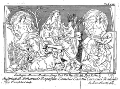
The Ara Pacis  or Altar of Augustan Peace was created early in the first century AD to honor the first Roman Emperor.  It was submerged in mud by the second century and wasn’t seen again until its partial rediscovery during the Renaissance.  The monument wasn’t fully unearthed until the early twentieth century and is widely considered to be one of the best examples of design and creation in stone.  The central figure representing Tellus, or Mother Earth dominates one panel of the monument and it is this figure of mother and twins which inspired me to create my cover. An engraving made in the early eighteenth century can be found in the public manuscript Inscriptiones antiquae in Etruriae urbibus exstantes dating from 1740, and published on the web for copyright free download by the University of Michigan.

ara pacis from book

This print of an engraving was not exactly what I was looking for but a close friend supplied an actual photograph from his travels in Italy and gave me his permission to use it. Not a high quality photo, full of lens distortions and exposure errors,  but it’s all I had at the time.

I decided to combine the two images, overlapping the drawing over the photograph and fusing the two together.  It required a good deal of manipulation and
geminknot-first-try

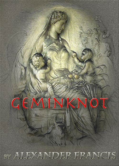
adjustment, and my first version is illustrated above.  Still, it didn’t make me happy, though I felt that I was on the right track.  Notice that the author’s name (mine) is not readable and overall, the cover is rather bland.  Several additional hours were given to the project using trial and error to achieve the final version included below.

GN_final

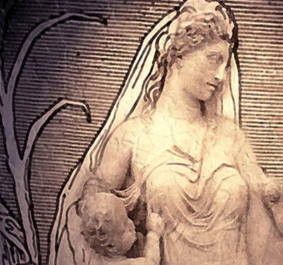
A close up shows the contribution of the engraving.

closeup_GN

In this case, as in others, the final version of the book’s cover preceded completion of my novel and added to my vision of the story.  I hope this brief illustration will help you understand that there is no set formula for book cover design.  You should be persistent, creative and reflect the book’s content, and above all, keep at it.

Alexander Francis

Images on this page and on this site, other than specifically indicated, are copyright by Alexander Francis and may not be used without written permission.

Using an image editor

Share

Although I have used imaging editing software for many years, I don’t consider myself an expert or an authority.  I am simply a fairly experienced user. There are many areas of book publication which will require use of image editing, and you will quickly see the need to learn the ropes.

Creating a cover is the theme of this blog, but also consider any graphics placed on the chapter headings, elaborate leading characters, decorative touches and flourishes.  Not only creating the images but sizing them for your page and converting them to the appropriate image type will require a photo or graphic editor.  You need to be able to work in layers, use transparent backgrounds and effects such as painting and drawing when indicated.  It sounds like a lot to learn, and it is, but a quality end product justifies the means. I believe there are many inexpensive imaging editors out there and more on the way.  At this writing, none are as versatile as Photoshop.  No endorsement intended, just fact.  It’s expensive and has a long learning curve but can accomplish nearly any task required.  Your software of choice will be used to output the file in pdf format using CMYK color mode stipulated by commercial printers, if you are creating a book for print. You will also need to create images in RGB for use on the web.

If your book is to be e-book only, you will simply create a cover page for display on the web.  Remember that the small thumbnail is all most people will see and keeping it interesting and readable at that size is the challenge. The proportions of the image are important, but there are no fixed rules.  You will find advice on the web which conflicts. Start with a minimum of 1600 x 1000 pixels using a resolution of 72 (web only).  You should also have a copy prepared using 2560 by 1600 pixels with a 72 resolution.  This gives a more dense image for the agencies to size to their needs.  More about this later.

If you are attempting a cover for a printed book, you need to create the front cover, spline area and back.  Most printing firms including CreateSpace and IngramSpark will create a file to your book specifications that you can use to size and place your image prior to submission. To use this template, you would download the file (in pdf or eps), load it into your image software, and overlay and size your graphic images.  It may sound difficult, but I assure you, it is an easy process.  Before you begin, you need to know the size of your book, the number of pages and choose the type of paper.  This is more difficult than first glance suggests.  You need to consider the font style and size, the margins, and any additional pages required to allow the chapters to start on the right (odd number) side. The so called ‘front matter’ and any marketing pages at the rear will add pages and thickness.  The front cover design should come last, but with me, it rarely does.  It seems to help me write the book if my cover page is nearly complete.  Odd, isn’t it, to use the cover to guide the book contents? I usually change the cover or modify it several times before I’m happy. Perhaps if I used more simple cover designs, it would not be so problematic.

I don’t intend this blog to be an instructional manual for Photoshop. There is a wealth of information available to help you in the form of books, websites,  and YouTube videos.  At the next blog, I will demonstrate some images I created for books and posters which may spark interest and get your creative juices flowing.

Alexander Francis

Creating a book cover

Share

Many people have commented favorably regarding my book covers, and in this column, I will give you some insight about my thought process and creative tools that I use.

The first thing which has to be emphasized is that images found on the web are, in general, off-limits for your commercial use no matter how tempting it may be to use them.  However, there are many sites providing  large image libraries that you can browse  and purchase an image for your use.  You don’t need a large, expensive image to make a cover.  For some situations, buying an image may be the practical solution. For instance, there may be a structure or place in a distant country you need to represent in your creation which may be otherwise impossible for you to obtain.  I’ve found that Wikipedia has many images which are clear of copyright and could be used.  Be sure and give Wikipedia credit someplace and also make a donation, at least periodically and read the fine print at the bottom of the page concerning copyrights before you use the image.

Because actual photographs are, in my humble opinion, a bit cheap looking on your cover, you are going to need to render the original photograph into a graphic image so that it can be manipulated and combined with other images.  It’s too obvious, but you need to consider the outside as a representation of the inside of your book.  Quality on the outside, quality on the inside.  Think about Apple products and how they are packaged!

The truth is that the poorest, most plain covers frequently wrap important and memorable books.  When you get famous you can get by with that approach.  Disregarding that disturbing fact for a moment, I will proceed with a brief explanation of the tools you need.

Just to let you know, at one time I was a passionate photographer, acquiring an extensive collection of gear.  I have even worked professionally in the field.  I’m the one who can tell you that, in most cases, you don’t need a high resolution photograph taken through a multi-thousand dollar lens to get a usable photo.  Since no one is listening, I’ll admit to you that I frequently use my cell phone camera these days.  Why not?  It’s at hand, and the images are usually very good.  With your little camera, you are free to take images of just about everything.  Notice I said almost. Today, you have to be a bit careful when you use an image commercially.  You and I aren’t newspeople; we are using an image for profit, and we will run into the same army of lawyers when we use an image of certain historical and copyright sites or products.  Don’t use a person’s image without permission either unless, you want to enable some attorney to retire early on your money.  Get permission in writing.

Now that we have the images we want to use, we need to combine bits and pieces of them, along with text, fashioning our creative cover. For me, the essential software is Photoshop by Adobe.  I don’t endorse Photoshop, and I have problems with the latest Adobe scheme for using their products.  I am using an older version which works just fine for now, and I am hoping competitors catch up soon. But first, I want to add a few words about the design of your book cover.  If you look at book listings on Amazon or Apple, you will see that the best images still look good when reduced to a thumbnail size. Print that is too small or placed on a background with inadequate contrast won’t look enticing or even legible to your potential readers (customers). Notice, also, that many  popular authors display their name prominently, often larger than the actual name of the book. This is a reflection of how people buy books, or see movies. The previous pleasant reading experience promotes the  purchase of his/her new book.  Or perhaps, it’s simply name recognition, much like the political arena.  If you are reading this, your name is  likely not well-known yet, and you should display the catchy title of your book larger than your pen name.

–more about the process at the next post.

Alexander Francis